Published
March 18, 2019
It’s time once again for one of our most interesting annual features – our state-by-state comparison of electricity prices. Similar to past years, we base our electricity rate map upon the most recent calendar year price data released by the U.S. Energy Information Administration (EIA). The electricity price “bands” highlighted on the map reflect what consumers, businesses, and industry must pay for a standardized unit – or kilowatt hour (kWh) – of electricity.
The 2018 version of our electricity price map again utilizes the streamlined “heat-map” theme we unveiled last year. This shading format readily identifies the states with lower electricity prices while highlighting those where residents are paying more to power their homes and run their businesses. Our individual state price page then groups all fifty states and the District of Columbia according to their respective price ranges. The states with competitive (i.e. lower) retail electricity prices are grouped toward the left, while the states where individuals and businesses are more likely struggling to pay their power bills appear toward the right.
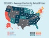
In general, most states retained their positions within our color-coded price bands. Iowa and Oregon experienced slight rate increases that caused them to lose their position in our lowest-price category. The District of Columbia rose (or fell, depending upon how you look at it) out of our middle-tier to join higher-priced Mid-Atlantic states, while Vermont saw its average rate elevate into our top – yet least enviable – electricity rate tier, where it joins many of its New England neighbors.
Looking back at our past maps helps to explain where rates have been and where they are likely trending in the future absent significant state or federal energy policy changes. Four years ago, our map illustrated a strong trend toward increasing retail electricity prices, with 2014 seeing all states except Michigan experiencing increases in their electricity rates. As newly accessible shale gas resources began to transform our domestic energy supply mix, the electricity price tide turned downward in 2015. Then, we identified a price decline across twenty states, while the prices in the remaining thirty states continued to increase. In 2016, increased shale gas resources really took hold, leading to a 2016 year-end rate map that reflected a nationwide annual rate decrease of .13 cents/kWh. Twenty-seven states experienced year-over-year declines in their rates in 2016, while twenty-three states – many of which were perennial low-price leaders – experienced increases.
In 2017, we unfortunately saw an overall increase in rates, contributing to a preliminary average national retail electricity price of 10.54 cents/kWh, which has since been revised downward by EIA to reflect a 10.48 cent/kWh national average rate in 2017. This rate was – until now – the highest national average retail electricity price recorded since we began tracking this metric.
While vast domestic shale gas resources continue to play an overall moderating role on national electricity rates, a growing backlog of needed natural gas delivery infrastructure is more than offsetting the low-priced resource that has helped to keep electricity prices in check across much of the country. In fact, it is likely that impediments to new natural gas pipeline infrastructure are the largest single contributor to 2018’s increased national average retail electricity price of 10.58 cents/kWh.
This is just another manifestation of the costs we all bear as a result of the “Keep it in the Ground” movement. As we exposed in our report “Infrastructure Lost,” activist efforts to block, delay, or cancel the fifteen projects we examined prevented at least $91.9 billion in economic activity. These efforts destroyed 728,079 job opportunities, and prevented approximately $57.9 billion in infrastructure investments. In addition, $20.3 billion in tax revenues were lost as a result of “Keep it in the Ground” activism. It is now clear that dramatically higher electricity prices are another negative side-effect of these anti-energy efforts.
While energy-rich states such as Pennsylvania and Ohio continue to watch their retail electric prices lowered by the benefits of abundant shale gas resources, New York and New England experienced across-the-board increases in their electricity rates during 2018. In fact, with the exception of perennially high-priced California, the top five absolute increases in state average rates across the continental United States occurred within New England.
So why does limited gas supply mean higher prices in the Northeast? It’s a simple tale of supply and demand. While the country on average depends on natural gas for 35% of national electric generation, the Northeast relied upon natural gas to fuel nearly 50% of its power plants. EIA data reveals that Massachusetts and Rhode Island lead the way in natural gas dependence, clocking in at 67% and 93%, respectively. Quite simply, more gas use and limited gas supply equals higher prices for New England.
This year, Rhode Island has the dubious “honor” of seeing the largest year-over-year electricity price increase in the country, save for geographically and electrically isolated Hawaii. Rhode Island saw its already high 2017 electricity rate of 16.42 cents/kWh balloon to 18.05 cents/kWh in 2018 – a ten percent increase! Connecticut, just next door, remains the most expensive state for electricity on the mainland United States, with an elevated 18.46 cents/kWh rate. Massachusetts lands with the second-highest rate (18.30 cents/kWh) in the continental U.S., followed by Rhode Island, New Hampshire (16.93 cents/kWh), and California (16.70 cents/kWh). As a whole census division, New England experienced double the increase of any other such region in the mainland United States (an increase of .95 cents/kWh), and in most instances saw more than a ten-fold increase as compared to other census regions, where 2018 regional average rates came out quite close to their 2017 averages.
Not only are Keep it in the Ground activists driving up New Englanders’ electricity rates, they may soon be preventing residents of the Northeast from accessing any of the clean-burning and low-cost attributes of natural gas in their homes and businesses. That is because natural gas providers across New York and New England are moving to impose moratoriums on new natural gas connections – all due to the limited ability to move the vast shale gas resources of Pennsylvania and Ohio a few hundred miles to the northeast.
New York’s blockade to new pipeline infrastructure, along with its statewide ban on hydraulic fracturing are clearing taking their toll. The question is – how much more can customers and businesses in New England take? Without new infrastructure, they could soon be looking at European-level electricity rates, along with limited access to natural gas altogether. While other regions of the country are happy to host the industries forced to flee the Northeast, an alleviation of the unproductive pipeline bottleneck would not only be good for that region, but it would be beneficial to America’s overall global competitiveness.
Note: In order to eliminate any confusion that may arise when making a direct comparison of this latest map to the 2017 electricity rate map, it is important to note that we utilize the U.S. Energy Information Administration’s (EIA) preliminary annual data, from the February edition of Electric Power Monthly, to develop our annual maps and rate comparisons. The EIA’s preliminary data is then subject to modification in the subsequent months as EIA finalizes their electricity price data. We use EIA’s preliminary data in order to deliver timely information, but slight variances from the final figures do occur. Please note, however, that for the purposes of comparing year-over-year trends, we have used EIA’s near-final 2017 numbers instead of the preliminary numbers used in our 2017 map to maximize the accuracy of our trend analysis.
Editor's note: This post originally appeared on the Global Energy Institute's Food for Thought blog.
About the authors

Heath Knakmuhs
Knakmuhs studies, develops, and communicates strategic energy policies and initiatives with a focus on the electric power sector. He also examines the impact of regulatory action, market-based factors, and emerging threats on the American electric grid.